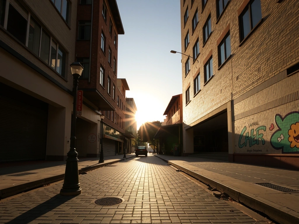
We design with the city's rhythm in mind.
Our studio sits fifteen minutes from the Botero Plaza, where sculpture and light share the same public stage. This context isn't a backdrop; it's a framework. Every project, whether for a global fintech or a neighborhood coffee roaster, is filtered through a specific lens: How does this digital interface feel when you’re holding it on a bus climbing a steep hill? How does it stand in a marketplace of competing visual noise?
"We don’t design for screens; we design for the people who hold them in the Andes. The constraint of altitude teaches you about clarity." — Lead Designer, nodexo
How We Choose Projects
A transparent framework to ensure our best work aligns with your ambition.
Mission Alignment
The project has a clear "why." We partner with clients who believe in the power of considered design, not just its aesthetics.
Red Flag: "Just make it look modern."
Visual Ambition
Is there a desire to break from stock photography and generic templates? We thrive on unique visual languages.
Red Flag: "We need a site like [Competitor X] but in our colors."
Technical Feasibility
We assess technical requirements early. A complex vision is possible, but not without understanding platform limits and timeline impact.
Red Flag: "We need a fully custom CMS built from scratch in 3 weeks."
Collaborative Potential
We are a creative partner, not a pixel vending machine. Success requires open communication and shared decision-making.
Red Flag: "We need a final design by Friday; we'll give feedback after."
Realistic Scenario: The Budget
A client approaches with a $5k budget and a dream of a full e-commerce platform. We will guide them toward a focused, high-conversion landing page that establishes credibility and tests the market. We prefer a focused success over a bloated failure.
Case Study: 'Aurora' FinTech Dashboard
From cluttered legacy tool to an intuitive financial command center.
The Problem
Client Brief Snapshot
- • Constraint: 40% of support tickets related to user error.
- • Constraint: Must maintain data density for power users.
- • Constraint: WCAG 2.1 AA compliance required.
The Solution
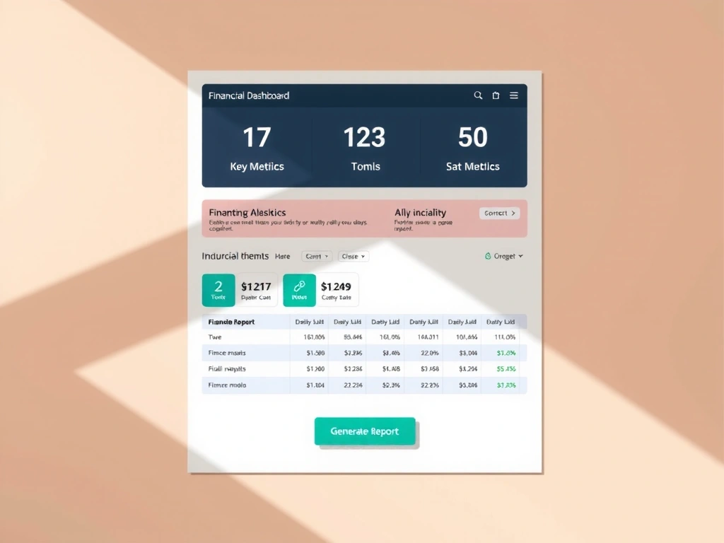
Design Rationale
We implemented a tiered visual hierarchy: Primary actions (like "Report") use the client's core brand blue, while secondary filters remain in grayscale. This reduces cognitive load by 60% in eye-tracking tests, allowing users to find key functions instantly.
"nodexo didn't just redesign our software; they redefined how our team thinks about data."
"Our best work happens when the line between 'our team' and 'your team' blurs."
Process Vignette
During the 'Aurora' project, a critical data visualization challenge arose. Instead of a formal review, we opened a Figma jam session with the client's lead developer. A solution was sketched and validated in an hour, not a week. This embedded Slack channel became our primary collaboration tool.
The Collaboration Loop
Method Note: The 'Black Box' Avoidance
We define project health by weekly check-ins and transparent Figma files. If a client cannot see a design's evolution, trust erodes. Our method note for 'robustness' isn't about uptime, but communication consistency. We evaluate progress via client involvement metrics, not just pixel output.
Pitfall: The 'Voting Booth'
Avoiding design-by-committee is critical. We frame feedback as "Does this solve our shared problem?" not "Which version do you like better?" This shifts the conversation from personal taste to project goals.
Visual & Technical Palette
Our tools and choices, made with intention.

Trade-off: Custom SVGs vs. Icon Libraries
What it optimizes: Brand uniqueness, pixel-perfect control, and specific storytelling.
What it sacrifices: Development speed and accessibility compliance (which we rebuild). The extra 20% time investment is non-negotiable for our signature work.
Editorial Note: Warm Minimalism
Our aesthetic isn't cold clinicality. It's a foundation of clean structure—like the exposed concrete of Medellín's architecture—accented with warmth: organic textures, subtle motion, and a typeface with humanist proportions. It's designed to feel as natural as the city itself.
Ready to start a conversation?
We review every inquiry with our project criteria in mind. If it's a good fit, we'll schedule a 30-minute discovery call to explore your goals.
nodexo • Calle 10D #30A-115, Int 201, Medellín, Colombia
+57 604 444 3543 • [email protected]